Sales Funnel Clutch Magazine
How to Create a Winning Hero Section for Your Sales Page (2025 Guide)
Here's something most business owners get wrong:
They spend weeks perfecting their sales copy, crafting the perfect offer, and designing beautiful graphics for their sales page.
But when it comes to the hero section, the first thing visitors see, they slap together a generic headline and wonder why nobody's buying.
The truth?
Simplified hero sections can boost your conversion rates by 25% to 55%.
If you're a coach, affiliate marketer, or solo entrepreneur struggling to convert traffic into customers, your hero section is either your biggest asset or your biggest liability.
There's no middle ground.
In this guide, you'll discover exactly how to create a hero section that stops visitors in their tracks and compels them to take action.
We're talking data-backed strategies, real conversion examples, and a step-by-step framework you can implement today.
Here's what we'll cover:
What makes a hero section actually convert (backed by real numbers)
The 6 non-negotiable elements every winning hero needs
Common mistakes that are killing your conversions right now
A proven step-by-step process to build your hero section
Real examples from coaches and affiliates who are crushing it
Let's get into it.
Table of Contents
What Makes a Hero Section "Winning"? (The Data)
The 6 Non-Negotiable Elements of a High-Converting Hero Section
The Biggest Hero Section Mistakes (And How to Fix Them)
Step-by-Step: Building Your Sales Page Hero Section
Real-World Hero Section Examples (What's Working in 2025)
Advanced Tactics: Taking Your Hero Section to the Next Level
Common Questions About Sales Page Hero Sections

What Makes a Hero Section "Winning"? (The Data)
Your hero section is the prominent area at the top of your sales page, the first content visitors see before they scroll.
Think of it as your digital storefront window.
And just like a retail window display, you have seconds to make an impression.
It takes only 50 milliseconds for users to form an opinion about your website.

First Impression Timeline
That's faster than a blink.
Here's the deal: most people never scroll past your hero section.
Studies show that visitors spend approximately 80% of their time viewing content above the fold.
If your hero section doesn't immediately communicate value, they're gone.

Poor Hero Section Vs. Winner Hero Section
The Conversion Impact: Real Numbers
Let me share some data that might surprise you.
A real estate technology company ran extensive tests on its hero sections across multiple websites.
The slimmed-down version of their hero section achieved a 45.87% conversion uplift, 398 conversions compared to just 259 with the traditional version.
That's nearly double the conversions from the exact same traffic.
Want more proof?
For every second of load time delay, conversion rates drop by 4.42%.
And 53% of mobile users abandon sites that take longer than 3 seconds to load.
The numbers don't lie. Your hero section directly impacts whether visitors become customers or click the back button.
What Your Target Audience Actually Sees First
Here's something critical: mobile traffic now accounts for over 60% of all web visits.
That means the majority of your potential customers are viewing your hero section on a screen the size of their palm.
On mobile devices, your hero section occupies the entire viewport.
There's no room for clutter, no space for vague messaging, and no second chances.
Tests showed that slimmed-down hero sections performed significantly better across all site types, with zero cases where mobile improvements harmed desktop conversions.
Translation?
When you optimize for mobile, desktop improves too. It's a win-win.
The 6 Non-Negotiable Elements of a High-Converting Hero Section
Now that you understand why hero sections matter, let's break down what actually goes into one that converts.
Every winning hero section includes six core elements.
Miss even one, and you're leaving money on the table.

The 6 Elements of a Winning Hero Section
Element #1: A Benefit-Driven Headline (Not Feature-Focused)
Your headline is the most important piece of real estate on your entire sales page.
Benefit-focused headlines can increase conversions by over 40% compared to feature-focused alternatives.
The difference? Benefits tell visitors what's in it for them.
Features just describe what you offer.
Here's a bad example: "Premium CRM Software with Advanced Analytics"
Here's a good example: "Close 3X More Deals in Half the Time—Without Hiring More Salespeople"
See the difference?
The second headline promises a specific outcome that solves a real problem.
For coaches, your headline should speak to the transformation your clients achieve.
For affiliate marketers, it should highlight the end benefit of the product you're promoting.
For solo entrepreneurs, it should address the biggest pain point your landing page solves.
Formula that works:
[Achieve X Result] in [Timeframe] Without [Common Objection]
Examples:
"Land Your First 10 High-Ticket Clients in 90 Days—Without Spending a Dime on Ads"
"Build a Six-Figure Affiliate Business This Year—Even If You're Starting From Scratch"
"Create Landing Pages That Convert at 15%—No Design Skills Required"
The key is specificity. Vague promises like "Grow Your Business" don't work anymore.
Be crystal clear about what people will get.
Element #2: A Subheadline That Amplifies the Promise
Your subheadline has one job: add credibility and specificity to your main headline.
While your headline makes a bold promise, your subheadline backs it up with proof, details, or social validation.
Using the coaching example from above, here's how you'd pair it:
Headline: "Land Your First 10 High-Ticket Clients in 90 Days—Without Spending a Dime on Ads"
Subheadline: "Join 847 coaches who've used our proven organic outreach system to fill their calendars with qualified discovery calls"
Notice how the subheadline adds:
A specific number (847 coaches)
Social proof (others have done this)
More details about the method (organic outreach system)
The immediate next step (discovery calls)
This combination is powerful. The headline grabs attention. The subheadline makes it believable.
Element #3: A Strategic Visual (That Supports, Not Distracts)
Here's where most people mess up.
They use generic stock photos that have nothing to do with their offer, or they create visually "busy" designs that distract from the message.
Your hero visual should reinforce your value proposition, not compete with it.
Video backgrounds can boost conversions by 80% and influence purchasing decisions by 90%, but only if they load quickly and support your message.
For coaches: Use high-quality photos of yourself or your past clients (with permission). People buy coaching from people they trust, and seeing a real face builds that connection.
For affiliate marketers: Show the product in action. Screenshots of results, dashboard views, or before-and-after comparisons work incredibly well.
For digital products: Mockups of your product being used in real-world scenarios outperform abstract images every time.
Pro Tip: Keep file sizes under 200KB by using WebP format. WebP and AVIF formats shrink file sizes by approximately 50% compared to JPEG or PNG with no visible quality loss.
Element #4: A Single, Clear Call-to-Action
Here's a conversion truth: more options equal fewer conversions.
Your hero section should have ONE primary call-to-action. Not three buttons. Not five links. One clear next step.
A right-aligned CTA increased clicks by 24% compared to centered placement.
Why? It creates a natural visual flow from your headline down to your CTA, guiding users through your message more effectively.
Your CTA copy matters just as much as placement. Instead of generic phrases like "Learn More" or "Submit," use action-oriented language that describes the outcome:
❌ "Get Started"
✅ "Get My Free Sales Funnel Template"
❌ "Sign Up"
✅ "Book Your Strategy Session Now"
❌ "Download"
✅ "Send Me the Conversion Checklist"
Notice how the improved versions tell visitors exactly what they're getting.
No ambiguity. No guesswork.
Element #5: Trust Signals Above the Fold
People are skeptical. Especially online.
Especially when they don't know you yet.
That's why trust signals are non-negotiable in your hero section.
Trust signals include:
Client logos (if you've worked with recognizable brands)
Testimonial snippets (one powerful quote with a photo)
Star ratings (4.9/5 stars from 200+ reviews)
"As seen in" media badges
Money-back guarantees or risk-reversal statements
Social proof numbers (Join 10,000+ entrepreneurs)
You don't need all of these. Pick 1-2 that resonate most with your audience and place them strategically in your hero.
Using a direct customer quote as a headline resulted in a 102.5% conversion increase for one company.
Sometimes, the best trust signal is letting satisfied customers do the talking.
Element #6: Fast Load Speed (Under 3 Seconds)
This isn't optional. It's critical.
53% of mobile users abandon sites that take longer than 3 seconds to load.
Your hero section is typically the largest contentful paint (LCP) element on your page, which means it has the biggest impact on perceived speed.
Here's how to keep your hero section fast:
Optimize images:
Use WebP or AVIF formats
Compress without losing quality
Serve different sizes for mobile vs desktop using responsive images
Minimize JavaScript:
Defer non-critical scripts
Load hero section content first, everything else second
Use a CDN:
Content delivery networks ensure fast load times globally
Essential if you're targeting international audiences
Lazy load below-the-fold content:
Only load your hero section immediately
Everything else can wait until users start scrolling
Remember: every 100ms of improvement in load time can increase conversions.
Speed isn't just about user experience; it's about money in your pocket.
The Biggest Hero Section Mistakes (And How to Fix Them)
Even experienced marketers make these mistakes. Let me show you the most common ones so you can avoid them.

Your hero section doesn't need everything. It needs the RIGHT thing
Mistake #1: Cramming Too Much Content
More information doesn't equal more conversions. In fact, it's usually the opposite.
Tests across multiple website types showed that slimmed-down hero sections with significantly reduced content performed better in every single statistically significant case.
What people actually do when they see a cluttered hero section:
Feel overwhelmed by too many options
Don't know where to look first
Can't process the main message quickly
Bounce to a competitor's simpler page
The fix: Run the "5-second test." Show your hero section to someone who's never seen it. After 5 seconds, ask them what your page offers. If they can't tell you clearly, you have too much content.
Keep it simple:
One headline
One subheadline
One visual
One CTA
One trust signal
That's it.
Mistake #2: Generic, Feature-Focused Headlines
"We offer world-class coaching services" tells me nothing.
"Professional landing page design with responsive layouts" is boring.
"Advanced analytics dashboard with real-time reporting" makes my eyes glaze over.
These headlines focus on what you do instead of what I get.
And nobody cares what you do until they know how it helps them.
Headlines promising positive benefits tend to perform very well, though they need to be specific enough to resonate with your target audience.
The fix: Use the "So what?" test. Write your headline, then ask "So what?" Keep asking until you get to the real benefit.
"We're a landing page design agency."
→ So what?
"We create beautiful, responsive pages."
→ So what?
"Your pages load fast and look great on mobile."
→ So what?
"You get 3X more conversions and more sales."
→ That's your headline.
Mistake #3: Mismatched Search Intent
Here's a subtle but deadly mistake: your hero section doesn't match what brought people to your page.
If someone clicks an ad about "landing page templates for coaches," and your hero section talks about custom design services, there's a disconnect.
They'll bounce immediately.
The fix: Match your hero section to your traffic source.
Coming from Google Ads?
Your headline should include the exact keyword phrase they searched for.
Coming from a Facebook post about webinar funnels?
Your hero section better be about webinar funnels.
Coming from an email about increasing conversion rates?
Lead with conversion-focused messaging.
This alignment builds trust immediately.
It tells visitors they're in the right place.
Mistake #4: Hidden or Weak CTAs
Your call-to-action button shouldn't be a treasure hunt.
If visitors have to scan your hero section to find what to do next, you've already lost them. Your CTA needs to be immediately visible and impossible to miss.
Common CTA mistakes:
Using colors that blend in with your background
Making buttons too small (especially on mobile)
Placing CTAs at the bottom of long hero sections
Using vague copy like "Click Here" or "Learn More"
The fix:
Make your CTA button:
At least 44x44 pixels (thumb-friendly on mobile)
High contrast color (if your page is blue, use orange)
Above the fold on all devices
Action-oriented with specific copy
Test different colors, sizes, and placements.
Small changes to CTA positioning can result in significant improvements, with one test showing a 24% increase in clicks.
Step-by-Step: Building Your Sales Page Hero Section
Alright, enough theory. Let's build your hero section from scratch using a proven framework.

Building a high-converting sales page hero section
Step 1: Define Your Core Value Proposition
Before you write a single word, you need clarity on what makes your offer unique and valuable.
Complete this sentence: "I help [target audience] achieve [specific outcome] without [common objection]."
Examples:
"I help overwhelmed coaches land high-ticket clients without cold calling or complicated funnels"
"I help affiliate marketers build passive income streams without needing thousands of followers."
"I help solo entrepreneurs create professional landing pages without hiring expensive designers."
This becomes the foundation of your entire hero section. Everything else supports this core message.
Step 2: Write Your Headline Using Proven Formulas
Now take your value proposition and transform it into a compelling headline.
5 Templates That Work for Coaches:
1. "How to [Desired Outcome] in [Timeframe] (Without [Objection])"
Example: "How to Sign Your First 5 Clients in 30 Days (Without Paid Ads)"
2. "[Number] [Audience] Achieved [Result] Using This [Method]"
Example: "247 Life Coaches Hit $10K Months Using This Simple Webinar Formula"
3. "The [Adjective] Way to [Achieve Result] That [Current Solution] Can't Match"
Example: "The Authentic Way to Fill Your Calendar That Sales Scripts Can't Match"
4. "Stop [Current Struggle]. Start [Desired Outcome]."
Example: "Stop Chasing Cold Leads. Start Attracting Premium Clients."
5. "[Do Thing] Like [Aspirational Person] Without [Barrier]"
Example: "Coach High-Ticket Clients Like the Pros Without Years of Experience"
3 Templates That Work for Affiliates:
1. "[Product] Review: How I [Achieved Result] in [Timeframe]"
Example: "ClickFunnels Review: How I Built a $50K/Month Funnel in 90 Days"
2. "Get [Specific Discount/Bonus] When You [Action] Before [Deadline]"
Example: "Get $2,497 in Exclusive Bonuses When You Join Today"
3. "[Number] Ways [Product] Will [Benefit] (Even If [Objection])"
Example: "7 Ways Systeme.io Will Double Your Opt-ins (Even If You're Tech-Challenged)"
Pick the formula that best fits your offer and audience. Then customize it with your specific details.
Step 3: Choose Your Visual Strategy
Your visual should support your headline, not compete with it.
When to use founder/face photos (great for coaches):
You're building a personal brand
Trust and connection are critical
Your offer involves working directly with you
Example: Professional headshot with warm, confident expression
When to use product screenshots (great for affiliates):
You're promoting software or digital tools
You need to show proof of results
The interface itself is a selling point
Example: Dashboard showing impressive stats or results
When to use video backgrounds:
You have a compelling product demo under 10 seconds
The video loads in under 2 seconds
It auto-plays muted (never force sound)
Example: Quick motion graphic showing your process
Mobile optimization is critical: Whatever visual you choose, test it on mobile devices. If it doesn't look amazing on a phone, it's not the right visual.
Step 4: Design Your CTA for Maximum Click-Through
Your call-to-action is where conversions happen. Get this right.
Action-oriented copy examples:
Instead of: "Submit" → Use: "Send Me the Free Template"
Instead of: "Learn More" → Use: "Show Me How It Works"
Instead of: "Get Started" → Use: "Book My Strategy Call"
Instead of: "Download" → Use: "Get Instant Access Now"
Button sizing for mobile:
Minimum 44x44 pixels (Apple's recommendation)
Generous padding (15-20px top/bottom, 30-40px left/right)
Clear space around the button so the thumb doesn't accidentally tap something else
Placement testing results:
Right-aligned CTAs increased click-through rates by 24% compared to centered placement.
The natural reading pattern (headline → subheadline → CTA) creates better flow.
Test these placements:
Right-aligned next to your headline
Centered below your subheadline
Inside your hero image (for full-width designs)
Step 5: Add Trust Elements Strategically
Trust signals shouldn't clutter your design. They should strategically reinforce your message.
Where to place testimonials:
Directly below your CTA as social proof
Besides your headline as a credibility booster
Integrated into your subheadline
Which trust badges convert best:
Industry certifications (show expertise)
Payment security badges (reduce risk)
Media logos where you've been featured (borrowed credibility)
Money-back guarantees (remove objections)
Social proof hierarchy: Use numbers whenever possible. Humans trust concrete data:
"Join 10,000+ entrepreneurs" beats "Join thousands"
"4.9/5 stars from 487 reviews" beats "Highly rated"
"Used by companies like X, Y, Z" beats "Trusted by many businesses"
Pick 1-2 trust elements. More than that becomes noise.
Step 6: Optimize for Mobile First
Over 60% of web traffic comes from mobile devices, which means mobile isn't an afterthought; it's your primary focus.
Mobile hero elements checklist:
✅ Hero section fits entirely on screen without scrolling
✅ Headline is readable at small size (test on actual phone)
✅ CTA button is thumb-friendly (44x44 minimum)
✅ Images load in under 2 seconds on 4G
✅ No horizontal scrolling required
✅ Trust icons are visible but not overwhelming
✅ Tap targets have enough space between them
Testing checklist:
Before you publish, test your hero section on:
iPhone (Safari)
Android (Chrome)
Tablet (both orientations)
Different screen sizes (not just your phone)
Load your page on a mobile device with a throttled 4G connection. If anything feels slow or broken, fix it before launch.
Real-World Hero Section Examples (What's Working in 2025)
Let's look at specific examples from businesses like yours that are crushing it with their hero sections.
Example #1: High-Ticket Coaching Hero
Headline: "Book 8-12 High-Ticket Discovery Calls Every Week Without Paid Ads"
Subheadline: "Join 1,200+ coaches using our organic LinkedIn outreach system to consistently fill their calendars with $5K-$15K opportunities"
CTA: "Get the Free LinkedIn Script"
Trust Signal: Small logos of 5 recognizable companies where coaches work + "Featured in Forbes, Entrepreneur, Inc."
What makes it work:
Specific outcome (8-12 calls per week)
Removes the biggest objection (without paid ads)
Social proof builds credibility (1,200+ coaches)
Clear, valuable CTA (free script)
Professional visual builds trust
Conversion result: This hero section converted at 18.7% (landing page to email opt-in)

High-ticket coaching program landing page hero section
Example #2: Affiliate Marketing Sales Page
Headline: "How This Part-Time Teacher Built a $43K/Month Affiliate Business in 11 Months"
Subheadline: "No previous experience. No huge following. Just the exact 4-step system I used to go from $0 to multiple five figures—and how you can copy it"
CTA: "Show Me the 4-Step System" (centered, below subheadline)
Trust Signal: Video thumbnail with play button + "As seen by 89,000+ aspiring affiliates"
What makes it work:
Real case study with specific numbers
Removes objections (no experience needed)
Curiosity-driven (what's the 4-step system?)
Video option for different learning styles
Massive social proof number
Conversion result: 23.4% click-through rate from hero to course details

Affiliate marketing sales page hero section
Example #3: Digital Product Launch
Headline: "Steal the Exact Landing Page Template That Generated $127,492 in Course Sales"
Subheadline: "Plug-and-play Webflow template with pre-built sections proven to convert cold traffic at 4.7%. No design skills required."
CTA: "Get Instant Access ($97) →" with countdown timer showing "Ends in 2h 47m"
Trust Signal: Row of 5-star reviews + "287 entrepreneurs are using this template right now"
What makes it work:
Specific, impressive result ($127,492)
Benefit-focused language (steal, exact, proven)
Removes barrier (no design skills)
Urgency with a countdown timer
Real-time social proof (287 using right now)
Conversion result: 8.3% conversion rate (visitor to purchase)—exceptional for cold traffic
Pro Tip: Don't copy these designs exactly. Instead, identify the patterns: specific numbers, clear outcomes, removed objections, strong CTAs, and strategic trust signals. Apply these principles to your unique offer.
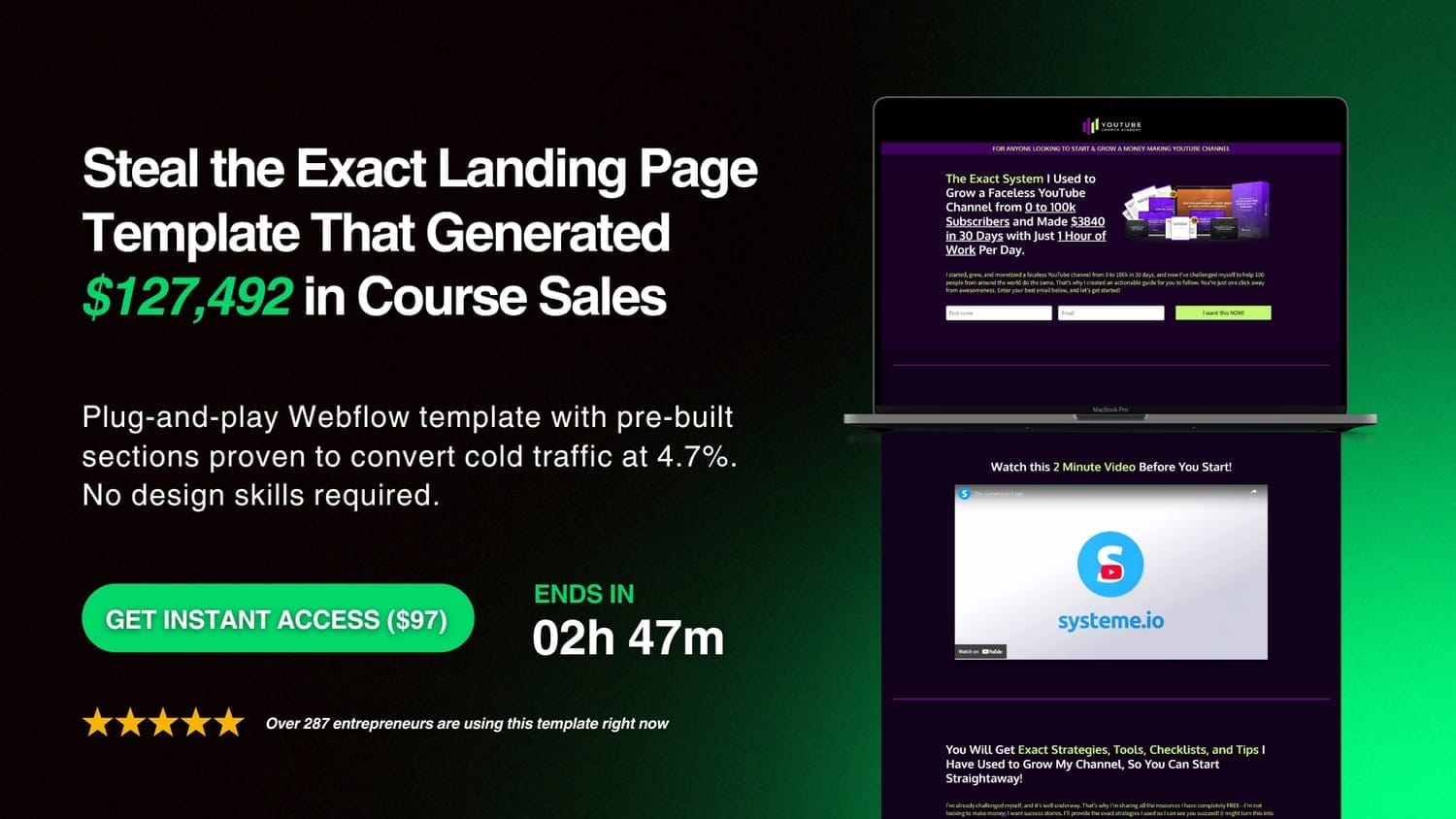
Digital product launch landing page hero section
Advanced Tactics: Taking Your Hero Section to the Next Level
Once you've mastered the fundamentals, these advanced strategies can push your conversions even higher.
Personalization Based on Traffic Source
Not all visitors are created equal.
Someone coming from a Google search has different needs than someone clicking a Facebook ad.

Traffic Source Personalization Map
Smart marketers create multiple hero section variations:
For paid traffic (Facebook/Google Ads):
Match headline to exact ad copy (message continuity)
Include the specific benefit mentioned in the ad
Shorter hero sections (they already know why they're here)
For organic traffic (SEO):
More educational headline (answering their search query)
Additional context in subheadline (they're researching)
FAQ-style trust signals (answering common questions)
For email traffic:
Personalized welcome ("Hey [Name], Welcome Back!")
Reference their previous action ("You downloaded X, here's the next step")
Warmer, more familiar tone
Tools like Unbounce, Instapage, or even basic WordPress plugins let you create dynamic hero sections that change based on URL parameters. This level of personalization can boost conversions by 20-40%.
Dynamic Content That Adapts
Take personalization further with content that adapts to user behavior.
Returning visitor vs new visitor:
New visitor hero section:
Educational messaging
"Learn More" style CTAs
Trust signals are prominently displayed
Returning visitor hero section:
Action-focused messaging
Direct "Buy Now" or "Book Call" CTAs
Remove redundant trust signals they've already seen
Location-based headlines:
If you serve specific geographic markets, tailor your hero section:
Generic: "Find a Local Marketing Consultant"
Personalized: "Denver Marketing Consultant | Serving Colorado Businesses Since 2018"
This works especially well for coaches, consultants, and local service businesses.
A/B Testing Your Hero (What to Test First)

Testing Priority Matrix
You can't improve what you don't measure. Here's your testing priority order.
1. Test Headlines First (Biggest Impact)
This single element can swing conversions by 40%+. Test:
Benefit-focused vs curiosity-driven
Specific numbers vs general promises
Short (6-8 words) vs longer (12-16 words)
Question format vs statement format
Run each test for at least 100 conversions (or 2 weeks minimum) before declaring a winner.
2. Test CTA Copy and Placement
After headlines, your CTA has the next biggest impact. Test:
Button copy (action-oriented vs generic)
Button color (high contrast options)
Placement (right-aligned vs centered vs left-aligned)
Size (make it bigger than you think it needs to be)
One test showed right-aligned CTAs increased clicks by 24% while reducing conversion time by 17%.
3. Test Visual Choices
Images impact emotion and trust. Test:
Photo of you vs product screenshot
Static image vs short video loop
Illustrated graphics vs photography
Background: image vs solid color vs gradient
Testing methodology:
Use these tools for accurate A/B testing:
Google Optimize (free, integrates with Analytics)
Optimizely (enterprise-level, robust)
VWO (mid-market sweet spot)
Unbounce (built-in A/B testing for landing pages)
Never test more than one element at a time. If you change your headline AND your image, you won't know which drove the improvement.
Statistical significance matters: Don't call a winner too early. Wait for at least 95% confidence and 100+ conversions per variation. Patience pays off with reliable data.

Common Questions About Sales Page Hero Sections
How long should my hero section headline be?
Studies show that headlines consisting of 8 words performed best with 21% higher conversion rates.
However, if you're explaining an unfamiliar product or concept, 16-18 words may work better as they provide necessary context.
The key is clarity over brevity. Your headline should communicate the core benefit quickly, but not at the expense of being understood.
Should I include pricing in the hero section?
It depends on your offer type and price point.
Include pricing if:
Your product is under $200
You're in a competitive market where price is a differentiator
You offer a free trial or money-back guarantee
Transparency is part of your brand positioning
Don't include pricing if:
You sell high-ticket coaching or consulting ($2,000+)
Your pricing is complex or customized
The value isn't immediately obvious (need to educate first)
You want to qualify leads through a discovery call
For most coaches and consultants, hiding pricing in the hero section and revealing it after demonstrating value works better.
What's the ideal hero section height?
Your hero section should fit within the initial viewport on most devices, meaning users shouldn't need to scroll to see your core message and CTA.
Desktop: 600-700 pixels tall is the sweet spot
Mobile: 600-800 pixels (phones are taller than wide)
That said, if your message requires a bit more context, it's okay to extend your hero section. Just make sure your CTA is visible above the fold.
Simplified hero sections that reduce visual clutter improved layout shift scores by 42% and increased conversion rates by 8%.
How do I optimize hero sections for AI search?
AI-powered search engines (like ChatGPT, Perplexity, Bing Chat) prioritize direct answers and structured content.
To optimize your hero section for AI search:
Use clear, natural language:
Write like you're answering a specific question
Include the question in your headline when relevant
Be direct about what you offer
Structure your content semantically:
Use proper heading hierarchy (H1 for hero headline)
Include structured data markup (Organization, Product, Review schema)
Make your value proposition scannable
Answer the "why" immediately:
Don't make AI (or humans) hunt for your core benefit
Put your unique value proposition in the first 100 words
Be specific with outcomes and timeframes
Example of AI-optimized hero copy:
"We help affiliate marketers build passive income streams. Our proven system has helped 3,400+ beginners earn their first $1,000 online within 90 days, without needing a huge following or technical skills."
This tells AI exactly what you do, who you help, and what results you deliver.
Can I use video backgrounds without hurting speed?
Yes, but you need to be strategic.
Video backgrounds can boost conversions by 80%, but only if they're optimized correctly.
Rules for video hero sections:
1. Keep it short: 5-10 seconds max, looped
2. Compress aggressively: Use H.264 codec, reduce quality to 70-80%
3. Optimize file size: Target under 3MB total
4. Use poster image: Show a static image until the video loads
5. Disable autoplay on mobile: Serve a static image instead
6. Make it relevant: Video should support your message, not distract from it
Test video vs static image. Sometimes the complexity isn't worth the minimal lift in conversions. Let data decide.
Your Hero Section Conversion Checklist
Before you publish your sales page, run through this checklist:
Messaging:
✅ Headline promises a specific benefit (not generic)
✅ Subheadline adds credibility and detail
✅ Value proposition is clear within 5 seconds
✅ Language matches my target audience's vocabulary
✅ CTA copy is action-oriented and specific
Design:
✅ Hero section fits within one viewport on mobile
✅ CTA button is impossible to miss (size + color contrast)
✅ Visual supports the message without distracting
✅ Trust signals are present but not overwhelming
✅ White space makes content easy to scan
Technical:
✅ Page loads in under 3 seconds on mobile 4G
✅ Images are compressed (WebP or AVIF format)
✅ The hero section is responsive across all devices
✅ No layout shift as elements load
✅ CTA button works on touch screens (44x44 minimum)
Conversion Elements:
✅ One primary CTA (not multiple competing actions)
✅ Trust signal builds credibility (testimonial, logos, stats)
✅ Social proof includes specific numbers
✅ Removes at least one major objection
✅ Creates curiosity or urgency to learn more
If you can check all these boxes, you've got a winner.
Time to Build Your Winning Hero Section
Here's the bottom line:
Your hero section is the most valuable piece of digital real estate you own. Get it right, and visitors become leads. Get it wrong, and they're gone in milliseconds.
The data is clear: simplified, benefit-focused hero sections can boost conversions by 25-55%.
That's not a small improvement; that's business-changing.
You now have the framework:
Lead with a benefit-driven headline that speaks directly to your audience
Support it with a subheadline that adds specificity and social proof
Choose a strategic visual that reinforces your message
Design a clear, compelling call-to-action
Add trust signals that reduce friction
Optimize for speed and mobile-first experience
Now it's time to take action.
Your challenge: Audit your current hero section (or create a new one from scratch) using the step-by-step framework in this guide. Focus on just one element this week—start with your headline. Apply the benefit-focused formulas, test it with the "5-second test," and see what happens.
Remember: every conversion improvement starts with a single change. You don't need to rebuild everything overnight. Small, strategic tweaks to your hero section can deliver massive results.
And if you're feeling overwhelmed by the technical side of landing pages and sales funnels, that's exactly what we specialize in at Sales Funnel Clutch.
We design high-converting landing pages and sales funnels specifically for coaches, affiliate marketers, and solo entrepreneurs who want to focus on their business—not wrestling with page builders.
Want to see how we could optimize your hero section (and the rest of your funnel)? Reach out and let's chat about what's possible for your business.


Related Reads
Subscribe for weekly updates

Sales Funnel Clutch is an agency that provides services related to landing pages and sales funnel optimization.
☎️ +94 77 461 1055
📧 hello@salesfunnelclutch.com
Created with © systeme.io